Bit Red
It all started with a glimpse of a coral coloured swing jacket hanging in the LYS. I fell in love with the colour. I'd been wanting to knit a swing jacket for some time. I had to knit it. Knit what? Noro Design 15 by Jenny Watson.
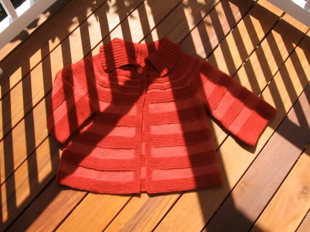

I'm not one of these brave bloggers who is able to post about their sweater knitting every step of the way. I don't have good luck with sweaters. This morning, my sister even suggested that I should stick to lace shawls, and perhaps the odd shardigan. Shardigan? Google it. 'Nuff said.
I finished knitting this last week. I almost didn't blog about it at all, but I've decided it's not a total loss. It does fit and feels good. The worst thing is that the colour doesn't suit me. Not at all.
I made a lot of mods to the pattern.
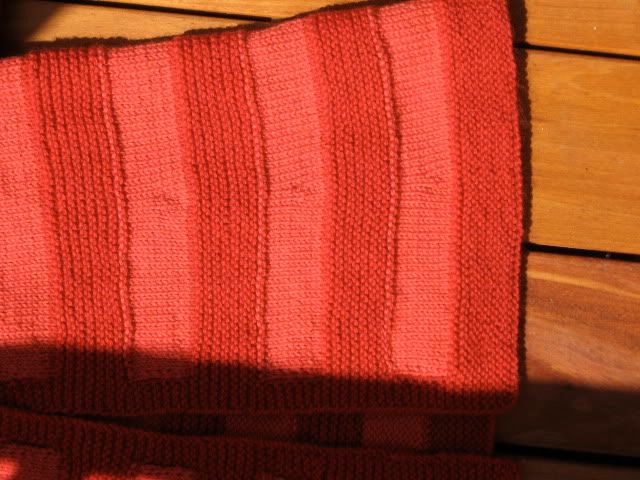
Here are some shots, starting with a close-up of the decreases on the sleeve.

I finished knitting this last week. I almost didn't blog about it at all, but I've decided it's not a total loss. It does fit and feels good. The worst thing is that the colour doesn't suit me. Not at all.
I made a lot of mods to the pattern.
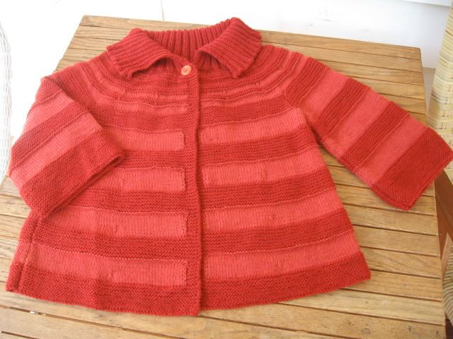
- First off, I made it longer than called for. I saw someone wearing it and decided it was just too short.
- I used a solid yarn rather than the variegated Noro called for by the pattern. I decided alternate two colours of Cascade 220 Heathers.
- Rather than knit all the way to the edges n the same colour, I used the basic intarsia technique to keep the lighter red in enclosed blocks. Why I though it would look like coral, I'll never know.
- I retained the basic bell shape of the sleeve, but I made it much narrower than the pattern called for (about 12 stitches narrower to begin with)
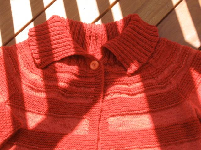
- I added a good six rows of short row shaping near the beginning of the ribbed collar.
Things I like:
- Style and fit.
- Good basic pattern with a few mods.
What I wish I changed:
- the colour!
- the yarn. Good for hats and mitts but not quite good enough for bigger pieces of clothing. Don't settle for the cheap yarn. Go for the Noro, or whatever. Save up.
- If I had it to do over, I would have tried to hide the decreases in the jacket body. You can probably see them in the pale area of the center fronts and back. Do you think I should embroider tiny red flowers over them, cover the ugly decreases with tiny buttons, or just ignore them?
Here are some shots, starting with a close-up of the decreases on the sleeve.




Comments
-Daughter
The shape looks very nice, and I think you should try something similar again.